MY ROLE
UI/UX Designer
UX Researcher
team
Rich Amparo, Founder
Saravanakumar Subramani, Developer Consultant
TOOLS
Figma
Illustrator
Notion
Typeform
Maze
TIMELINE
February 2024 - Ongoing
description
Kawani, a volunteer management app, emerged from a collaboration aimed at addressing the challenges faced by parents and teachers in coordinating school activities. This case study delves into the journey of designing Kawani to simplify scheduling, improve communication, and enhance the overall volunteer experience.
CONTEXT
During a conversation with my former colleague, Rich, who actively participates in his child's school volunteer activities, I learned about the challenges parents and teachers encounter with the current management system. Recognizing the opportunity to improve volunteer coordination, I embarked on designing Kawani to address these pain points and enhance the volunteer experience.
Additionally, understanding the importance of practical implementation and scalability, I reached out to Sara, a former colleague and experienced application developer, for consultation. Collaborating with Sara ensured that the design considerations align with real-world development needs, enhancing the project's feasibility and potential for future scalability.
This project holds personal significance as it aligns with Rich's passion for improving volunteer coordination at his child's school. Inspired by his dedication, I'm committed to designing the best user experience for Kawani, ensuring it meets the needs of both parents and teachers involved in school volunteer activities.


Welcome to Kawani!
As a volunteer, you can browse and sign up for school events easily. Get ready to make a difference in your school community!
Skip
Next
Active Helpers: PE Duty Assistance
Start
Fri, Aug 2 at 1:10 PM
End
2:00 PM
Falcon Academy School, Gymnasium
Get active and make a difference with our PE Duties event!
Volunteers Needed
3
Repeat
Every 2 Weeks
Active Helpers: PE Duty Assistance
Create Event


Hi, Ms. Smith! Thank you for organizing the school fair last weekend. My kids had a blast!
Hi there! So glad to hear your family enjoyed the fair. It was a team effort, and we're grateful for your support!

overview
Kawani is a volunteer management app tailored for local schools, aiming to streamline coordination efforts for morning and afternoon student drop-offs, pick-ups, and PE duties. Through user-centered design and extensive research, Kawani seeks to simplify scheduling, improve communication, and enhance the overall volunteer experience for parents and teachers.
the challenge
Parents and teachers struggle with the inefficiencies of existing volunteer management systems, including limitations in scheduling flexibility, lack of real-time updates, and difficulties in user registration and communication.
User Research Pain Points
Users of the current volunteer management system encounter several challenges that hinder their experience. These include limited scheduling flexibility for unique events, complexities in user registration and communication processes, and the absence of real-time updates and reminders for volunteer activities. Addressing these pain points is crucial to improving user satisfaction and streamlining the volunteer management process.
pain point 1
Flexibility Meets Limitations
Need to limit the number of volunteers based on an event, leading to difficulties once the maximum number of volunteers have signed up.
Setup can be challenging, such as registration of volunteers, especially for PE duties.
Lack of control over days without events, like national holidays, which impacts scheduling.
pain point 2
Registration Roadblocks
Users find it cumbersome to use separate platforms for signing up and registering for events.
Lack of a clear agreement regarding mobile phone usage during events, causing potential confusion.
pain point 3
Real-Time Reliability
Absence of confirmations or reminders during the registration process.
Inability to cancel volunteer spots easily, resulting in inefficiencies for those managing the app, such as teachers.
the goal
The goal of Kawani is to create a user-friendly volunteer management app that simplifies scheduling, enhances communication, and improves the overall volunteer experience for parents and teachers involved in school activities.
crafting user personas
To create a user-centered design, I developed two personas, Carmen and David, representing the diverse needs and aspirations of Kawani's target audience. Carmen, a multitasking mom, and David, a dedicated PE teacher, provided valuable insights into the user experience and informed design decisions.

This is Carmen, she is married with 3 children and owns a small business.
Carmen seeks to streamline the process of coordinating drop-offs and pick-ups to save time in her busy mornings but
Often finds it difficult to quickly access and understand the current schedule.


This is David, he is a physical education teacher.
He desires seamless communication with other teachers, students, and parents but
Finds it challenging to keep parents and colleagues informed about any changes or updates in the PE schedule.

Capturing User Stories
User stories were crafted to outline specific tasks or goals that Carmen and David aim to accomplish using the Kawani app. These narratives provided a framework for understanding their needs and expectations, guiding the development of features and functionalities that address their requirements effectively.
User Story 1 - Carmen
As a dedicated business owner, my mornings are hectic, managing both my business and getting my kids to school on time
I want to streamline the process of coordinating drop-offs and pick-ups
so that I can save time in my busy mornings and be informed about any changes or updates
User Story 2 - david
As a PE teacher in the local school
I want to easily manage and update the PE duties schedule for grades 1 to 6
so that I can ensure seamless communication with other teachers, students, and parents regarding any changes or special agents related to PE.
visualizing user journeys
The user journey map visualized Carmen and David's interactions with the volunteer management system, from registration to completing volunteer duties. This visualization highlighted key touchpoints, pain points, and opportunities for improvement, aiding in identifying areas to enhance the user experience in the Kawani app.

⬅️ ➡️ Carmen's user journey map, David's user journey map
Leveraging Market Insights
In evaluating the competitive landscape for volunteer management apps, key competitors were assessed for strengths and weaknesses. Opportunities identified through this analysis were framed into a "How might we" statement, aiming to leverage market gaps and enhance Kawani's competitive advantage.
In light of these insights, our "How might we" statement aims to leverage these opportunities:
How might we enhance mobile app accessibility and design to address shortcomings in existing volunteer management platforms, ensuring Kawani offers a seamless user experience for volunteers and organizers?
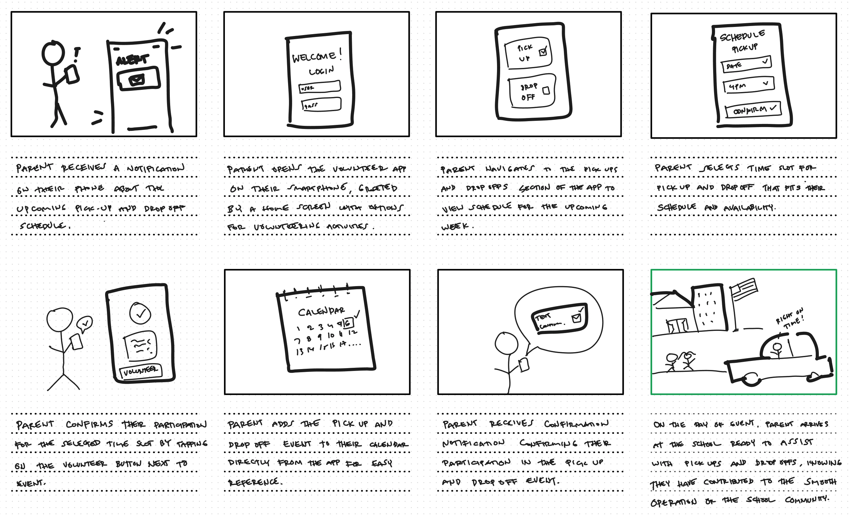
Storyboarding Seamless Experiences
Storyboarding was employed to illustrate a seamless user experience, starting with event notifications and ending with confirmed participation. This visual representation showcased the app's potential to enhance volunteer management for parents and teachers.
Iterating Design Solutions
For the user flow, a concise approach was taken, focusing on creating distinct roles for volunteers and organizers to yield the best results. This decision was informed by insights gathered from similar projects in the UX field, aiming to capture login processes and navigation pathways effectively.


Crafting accessible wireframes
Paper wireframes were created to prioritize user-friendliness and accessibility in every design element. I aimed for simplicity and ease of use, ensuring that even users with limited technical proficiency could navigate the app effortlessly.


Transitioning to digital wireframes facilitated the integration of elements, addressing concerns related to user information capture and security in sign-ups. Rich emphasized the importance of capturing user data, especially since volunteer list management depended solely on Google Sheets. Additionally, security concerns in the sign-up process were identified. To mitigate these issues, separate forms were designed for volunteers and organizers during account creation, ensuring the collection of essential user details in a secure manner.


⬅️ ➡️ Volunteer form, Organizer form
Once a volunteer selects a date, the interface transitions to a time slot selection screen, guiding users through the process of entering their details before completing the sign-up. Alongside, users are prompted to select a corresponding teacher, verifying the student's enrollment at the school for security purposes. This functionality directly addresses the identified pain point of verifying volunteers' affiliation with the school, ensuring robust security measures in line with our research findings.
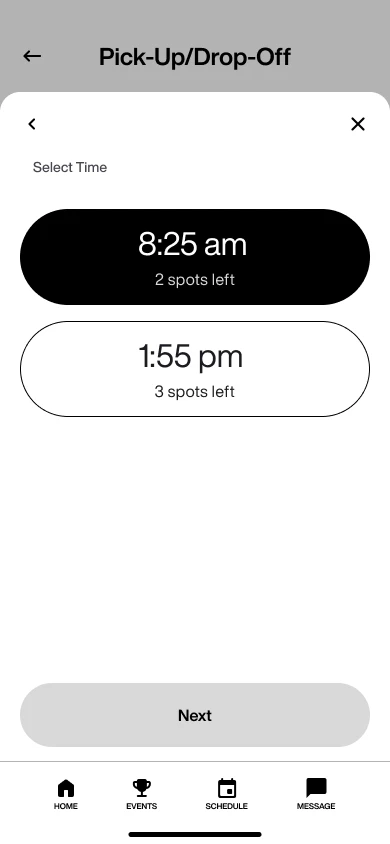

⬅️ ➡️ Selecting time, Volunteer registration form
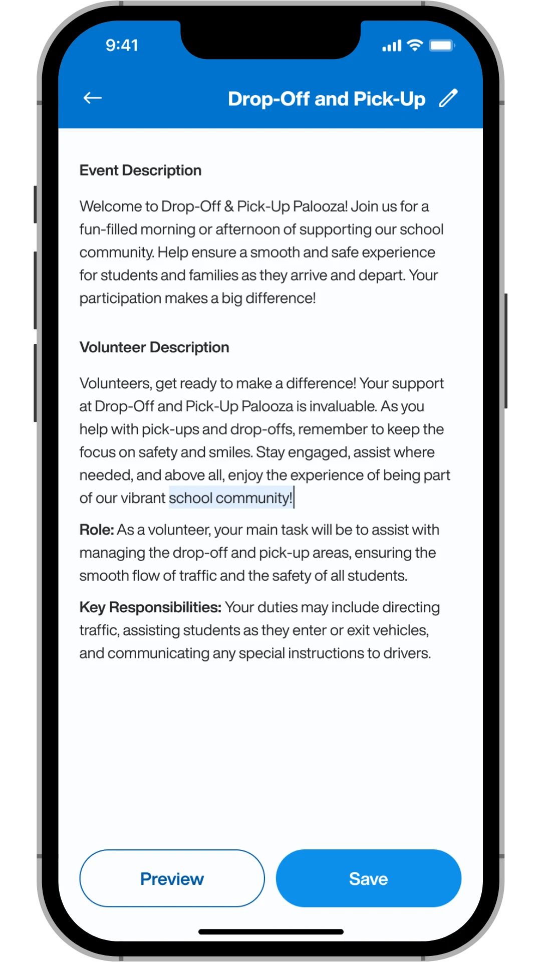
On the organizer side, I designed a dashboard providing organizers with a high-level overview of the events they've created, along with easy access to event creation and editing functionalities. Organizers can effortlessly edit their events, previewing them before publishing to ensure accuracy and completeness.


⬅️ ➡️ Organizer dashboard, Event editing screen
Effortless Account Creation
After usability study, on the account creation, instead of presenting users with a single form where they enter all their information at once, I chose to implement a step-by-step onboarding process. This approach allows users to focus exclusively on the details required at each stage. Once users input their child's names, they are prompted to select a teacher associated with their child to confirm enrollment and validate their affiliation with the school.


Streamlined Efficiency and Enhanced Safety Measures
Recognizing the hassle users faced with repeated data entry during sign-ups, I aimed to simplify the process. By automating account information capture, volunteers now enjoy a seamless experience. Once signed up, their details like name and email effortlessly populate event summaries. No more repetitive forms, just streamlined efficiency.
Additionally, I introduced an agreement notification to ensure volunteer attentiveness, reminding them of safety protocols like abstaining from cellphone use during volunteering for enhanced focus and security.
Enhancing Efficiency for Organizers
While reviewing the organizer interface, I noticed that I had overlooked including a screen demonstrating how organizers could create events. To address this oversight, I updated the interface to ensure consistency for both existing and newly created events. This included refining the event editing screen to provide organizers with a seamless experience when making changes or creating new events.

Before usability study

After usability study, see high-fidelity prototype here
Addressing Volunteer Limits
To overcome the challenge of managing volunteer limits, I designed a solution allowing organizers to specify the maximum number of volunteers needed for an event. Additionally, I implemented a feature enabling organizers to delete volunteers from the schedule with a simple tap, enhancing flexibility and control. See the solution in action below:
Setting Volunteer Limits: Organizers can easily set the maximum number of volunteers required for an event during creation.
Managing Volunteers: Once an event is created, organizers have the ability to delete volunteers from the schedule, ensuring optimal volunteer management.

Setting Volunteer Limits
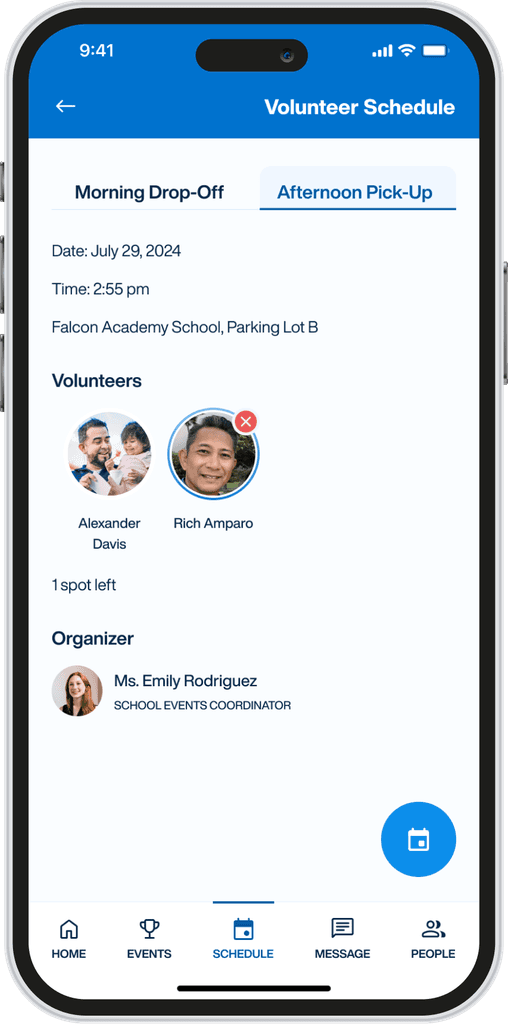
Managing Volunteers
In response to user feedback, I enhanced the calendar functionality by implementing an option for a weekly view, complementing the existing monthly view. This upgrade offers organizers greater flexibility and a comprehensive overview, addressing scheduling challenges. Additionally, I incorporated a feature to mark national holidays and events, further empowering users with improved visibility and control.


In the accessibility aspect, I meticulously reviewed the color scheme to ensure it complies with accessibility standards, guaranteeing sufficient contrast for users with visual impairments. Additionally, I prioritized flexibility in schedule viewing by incorporating both monthly and weekly options in the calendar feature. These enhancements not only improve usability but also cater to diverse user needs, contributing to a more accessible and inclusive user experience.
Impact
The usability study conducted with participants for both volunteer and organizer roles revealed overwhelmingly positive feedback. Users praised the platform's simplicity and clean interface, finding it easy to navigate and use efficiently. They appreciated the platform's ability to offer detailed information while maintaining simplicity, making it quick and intuitive to find relevant volunteer opportunities. One participant remarked, "Ease of use. Lots of spots for organizers to enter valuable information about the events/volunteering opportunities". This feedback captures the positive sentiment regarding the platform's user-friendliness and its effectiveness in facilitating event management and volunteering.
What I learned
Embarking on my first volunteer management app project was an enlightening journey that taught me invaluable lessons. I quickly grasped the importance of meticulously planning user flow and data collection before diving into design. Seeking guidance from a former colleague as a consultant ensured practicality and feasibility in real-world implementation, enriching the project's trajectory.
As the project unfolds, with some screens still under development, participant feedback sheds light on areas for improvement. One participant highlighted a concern on the organization side, noting that the app allows event creation even with incomplete details. To address this, a screen prompting users to complete fields before event creation is essential, ensuring data accuracy and user clarity.
A notable focus throughout was ensuring color accessibility standards, a skill I honed to improve UI hierarchy and spacing. Seeking feedback from seasoned UX designers affirmed my progress, with one noting, "I liked the simplicity and the proper use of colors and font sizes.". Their praise reaffirmed my growth and motivates me to continue refining my craft in the ever-evolving field of UX design.
"Kawani" – a Filipino term representing unity, collaboration, and teamwork – embodies the essence of our volunteer management app. Derived from Tagalog, it reflects the core values of inclusivity and community that drive our platform. The logo, with its two figures leaning back to back, symbolizes the spirit of teamwork and mutual support, mirroring the collaborative efforts of parents, teachers, and volunteers in creating positive change within schools.

Primary Color: Blue (#0072CE) - Instilling trust, stability, and professionalism, our primary color reflects our commitment to community and organization. With a sense of reliability and confidence, it sets the tone for a seamless user experience on the Kawani app.
Secondary Color: Green (#4CAF50) - Symbolizing growth, harmony, and positivity, our secondary color embodies the nurturing and supportive nature of our app. It speaks to our dedication to fostering strong communities and enhancing the volunteer experience for all involved.
Mariner
#0072CE
Apple
#4CAF50
Helvetica Now Display was chosen for its unparalleled clarity, modern aesthetic, and global accessibility, ensuring a seamless and trustworthy user experience on the Kawani app.

