

the challenge
Kawani encountered hurdles in meeting the distinct requirements of Admin users, particularly as they want to transition from using platforms like Calendly and Google Calendar.
This shift presented challenges in seamlessly coordinating volunteers and organizers, impeding the efficiency of the volunteer management process. Admins grapple with the complexity of managing organizer users within the Kawani app. Existing limitations hinder their ability to efficiently oversee organizers' activities, from inviting and suspending accounts to controlling event creation privileges. Addressing these challenges is pivotal to enhancing admin usability and optimizing organizer-centric volunteer management.
How might we equip admins with the necessary tools to seamlessly manage organizer users and streamline the volunteer management process within the Kawani app?
Insights into Admin Navigation and Feature Utilization
The research aimed to assess the app's usability from the perspective of Admin users, emphasizing key functionalities such as role selection, event management, dashboard exploration, settings, and user permissions.
Assumptions were made regarding user navigation and the potential value of summary charts for tracking event and organizer performance.
pain point 1
Lack of control and visibility over organizer users in the app
Admins lacked the necessary tools to manage organizer users effectively.
pain point 2
Calendar Synchronization
The absence of calendar synchronization posed a challenge.
the goal
This project sought to elevate the usability of the Kawani app for Admin users, with a focus on refining their workflow to enhance their overall experience in managing volunteers.
crafting user personas
Through meticulous user research, Maria's persona was developed to embody the needs and obstacles encountered by administrative users similar to her. Paired with her user journey map, these visual representations offer invaluable insights into Maria's interactions with the Kawani app, informing the design process to effectively address her needs and elevate her overall user experience.

This is Maria, she is the PTO President Volunteer Chair.
Maria seeks to streamline volunteer coordination efficiently. She desires intuitive tools but


starting the design process
In the initial stages of design, paper wireframes were utilized to conceptualize the admin user interface.
The primary objective was to seamlessly integrate it into the user flow, addressing pain points identified through user research. Emphasis was placed on enhancing the admin's user management capabilities and calendar synchronization with created events, resulting in iteratively refined wireframes for a cohesive and intuitive user experience.

The digital wireframes illustrate an intuitive onboarding journey for admins, facilitating essential setup tasks with clarity.
Admins first define their role—Admin, Organizer, or Volunteer—ensuring personalized access privileges. Subsequently, they establish a team name for streamlined data organization. Finally, admins securely add users through three pathways: shared link, contacts, or email, maintaining comprehensive control over team invitations.

Role selection
Users are guided to select their role—Admin, Organizer, or Volunteer—ensuring tailored access to relevant features and functionalities. This clear distinction optimizes user navigation, providing intuitive guidance for effective role fulfillment.

team name creation
The creation of a team name facilitates organized data management, enabling seamless grouping of team members. This design decision empowers admins with control over team composition, ensuring logical organization and efficient collaboration.

user addition options
To address security concerns, admins are offered three secure options for adding users: via a shared link, contacts, or email. Furthermore, admins retain control over team invitations, with three accessible options within the app. These design choices prioritize user security and accessibility, enhancing the overall user experience.
The subsequent screens showcase the robust user management capabilities tailored for admins. With intuitive interfaces, admins effortlessly oversee user roles, permissions, and access levels, ensuring streamlined collaboration and optimized organizational efficiency.

settings control
The Settings screen provides users with comprehensive control over various features, with a primary focus on accessing user permissions, enhancing customization and flexibility.

user permissions
The User Permissions screen empowers users to fine-tune settings and permissions, enabling precise control over what information organizers or volunteers can access in the app, promoting security and data integrity.

organizer profile management
On the organizer's profile page, users can seamlessly manage accounts, including deactivating them, thereby retaining control over the organizers on the app and ensuring smooth user administration.
usability study insights
During the usability study, participants provided valuable feedback on various aspects of the Kawani app, helping to refine its user experience.
Study Type:
Unmoderated and Moderated Usability Study
Participants:
3 School staff, 2 Volunteer advocates
Age:
25 - 65 years old
Length:
Each session will last 5 to 10 minutes, based on a list of prompts and tasks
Tools:
Typeform, Notion
On inviting new users
4.75
out of 5 for ease of use
Permission Management
were satisfied
90%
Round 1 findings
Role Expectations and Goals: 80% wanted to manage event organizers and volunteers.
Inviting New Users: Rated 4.75/5 for ease.
Permission Management: Mixed responses.
Usability Satisfaction: 90% were satisfied.
Round 2 findings
Dashboard and Analytics: Suggestions for color differentiation and event-specific metrics.
Insights on Dashboard Reporting
While dashboard reporting was not initially considered a pain point, insights from Databox highlighted its importance.
source: databox, aug 2023
In addition to the usability study findings, insights from a survey conducted by Databox shed light on the significance of dashboard reporting in businesses.
According to the survey, dashboard reporting is considered a crucial tool by 75% of respondents, contributing to increased efficiency, improved communication, saved time, and enhanced productivity. These insights reinforce the importance of integrating comprehensive dashboard functionalities into the Kawani app, ensuring admins have access to valuable metrics and reporting tools to optimize event management processes.
refining the design
Following insightful usability study findings, I transitioned from low-fidelity prototypes to high-fidelity mockups, infusing color and interactivity into the design. This phase involved refining user interactions and visual aesthetics while maintaining consistency with the user flow, ensuring seamless navigation from organizer to volunteer roles.
Adding New Users
Robust user management capabilities were tailored for admins, ensuring streamlined collaboration and organizational efficiency.


adding users by email


adding users by shared link


adding users by through contact list


user addition options
The screen displays three primary methods for user addition: sharing a link, adding via contact list, or through email invitations.
User Management and Access Controls
Strategic redesign ensured clarity, efficiency, and ease of use for administrators.
Before
Initial feedback highlighted a mixed response among users regarding the clarity and usability of the feature grouping, suggesting room for improvement.

Settings

After
Redesign provided more intuitive organization for admin users.


updated settings screen


Initial dashboard interfaces provided a clear overview of event summaries, organizer performance, and volunteer engagement.
Although initially this was not identified as a pain point, further research and feedback revealed the usefulness of adding dashboard analytics. One user mentioned, "This information will be useful to see volunteer turnout for specific events." - Participant A.
After the round 2 usability study, some users suggested using different colors for volunteer engagement metrics, which offered valuable insights for further improvement.
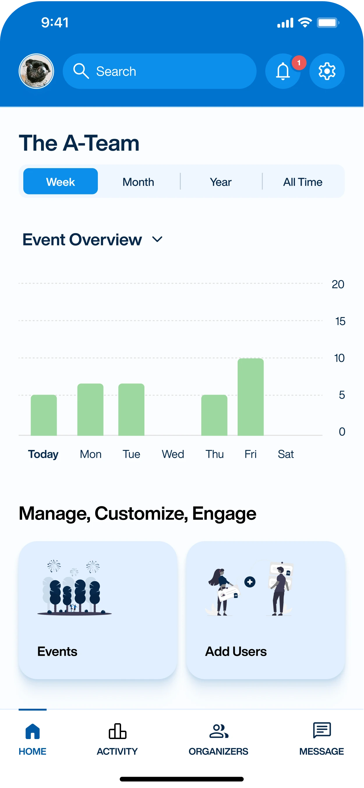

event summary


organizer performance


volunteer engagement
Ensuring Inclusive User Experiences
In the development of the Kawani app's admin user interface, accessibility was a paramount consideration.
Careful attention was paid to elements such as color contrast and font readability to enhance the experience for users with visual impairments. Additionally, thorough testing was conducted to ensure screen reader compatibility, enabling seamless interaction for all users, regardless of their abilities.

key takeaways
The design efforts resulted in a significant positive impact on the school community administrators, receiving overwhelmingly positive feedback. Users appreciated the new admin features for revolutionizing their event management process.
Key Metrics:
User Satisfaction: 5 out of 7 users rated very satisfied (5/5), and 2 users rated satisfied (4/5).
"The new admin features will revolutionize our event management process."
Participant A
"Very Satisfied. Can’t Wait To Try It Out!"
Participant C
Lessons Learned
This project presented numerous learning opportunities, particularly in navigating unfamiliar territory and integrating new design elements seamlessly into the existing user flow. Ensuring accessibility compliance was a key focus, with thorough testing conducted to meet WCAG standards and ensure readability for all users.
Next Steps
Moving forward, the journey continues with further iterations and refinements. The next phase will prioritize enhancements to the dashboard analytics, alongside additional usability studies to validate design choices and ensure optimal user experience.